Your book’s cover is usually the first thing that potential readers see, in a newsletter, blog post or AMS ad. Just like the blurb, covers make a specific set of promises to the reader about what they will be getting in the book – in particular, covers usually tell the reader about the genre and subgenre of the book. They also play an important role in author branding, making sure readers can identify two books by the same author, even at thumbnail size.
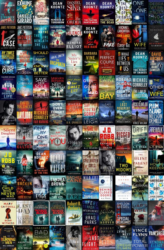
To learn about covers with Kindletrends, let’s start with the cover montage in a newsletter:

Each week for a few weeks, scan the cover montage and identify the different groups of cover styles. Covers in the montage are grouped by similarity, so you’ll generally see covers in a series, or by the same author, grouped together. You’ll typically see two or three different major types of cover in the Top 100, with a sprinkling of other covers that don’t fit any group. Make notes about the groups which persist from week to week, and about what you think is in each book, based on the cover elements.
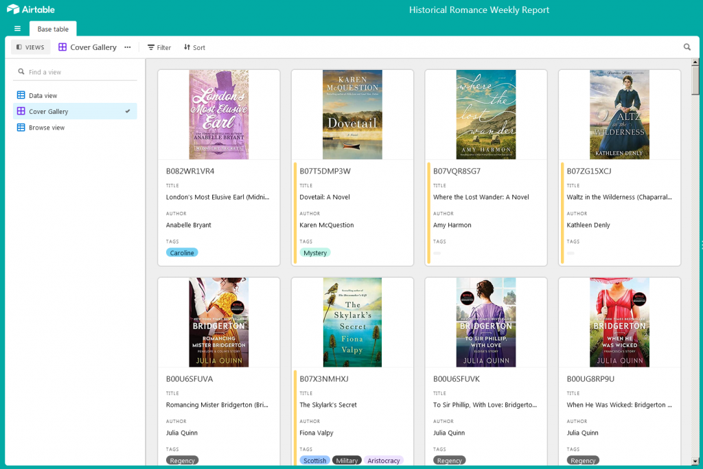
When you’ve got an idea of the major types of cover in your genre, open the Dashboard, and go to the Cover Gallery:

From the Cover Gallery, you can filter by topic tags, or by words in the blurb, as we did in Part 2. Just like in Part 2, choose a couple of topic tags relevant to your books, and filter by those tags; this will show you the covers for Top 100 books with those story elements present. Scroll through the Cover Gallery, taking note of the following elements for each cover:
- People: their presence or absence, framing (face only, in close-up, whole body), angle, dress style
- Objects: how are they relevant to the story?
- Colour: what are the dominant colors and shades? The colorboard in the weekly newsletter can help with this as well
- Typography: font size, type placement. Relationship between the author name and the title – are they in different fonts?
- Other cover elements: taglines or devices (for instance, badges or medals)
- Series and author similarities: for books in a series or by the same author, what are the consistent elements which make it clear that these books are related?
Next, double-click on the image in the Cover Gallery to bring up the detail for each book, and read the blurb while referring to your notes:

Look for specific elements in the cover which are linked to key words or phrases in the blurb. Just like with blurb research, your goal is to understand what each element in the cover tells the reader – something about the genre, about this specific story, or about the author or series.
Keep doing this each week for a few weeks. When you’ve done this a few times, you’ll be in a good position to choose a few specific covers as a basis for your own. As you work with a cover designer, this exercise will allow you to send them relevant examples of covers in your genre, and also to be specific about the cover elements you want in your own cover, and why.
Further reading:
- Nate writing at Hidden Gems has an excellent four-part series on cover design (Part 1, Part 2, Part 3 and Part 4). Even if you’re employing a professional designer, this is a worthwhile read for coming up with your own basic concepts, and for understanding the process of cover design from the inside.
- I don’t have specific recommendations for cover designers, because they will vary a lot from time to time, and genre to genre. When you see covers you like, try checking in the acknowledgements in the book (which may be visible from the Look Inside) to see if the designer is credited. If not, consider emailing the author and asking them; most authors are happy to support their cover designers with more work.

